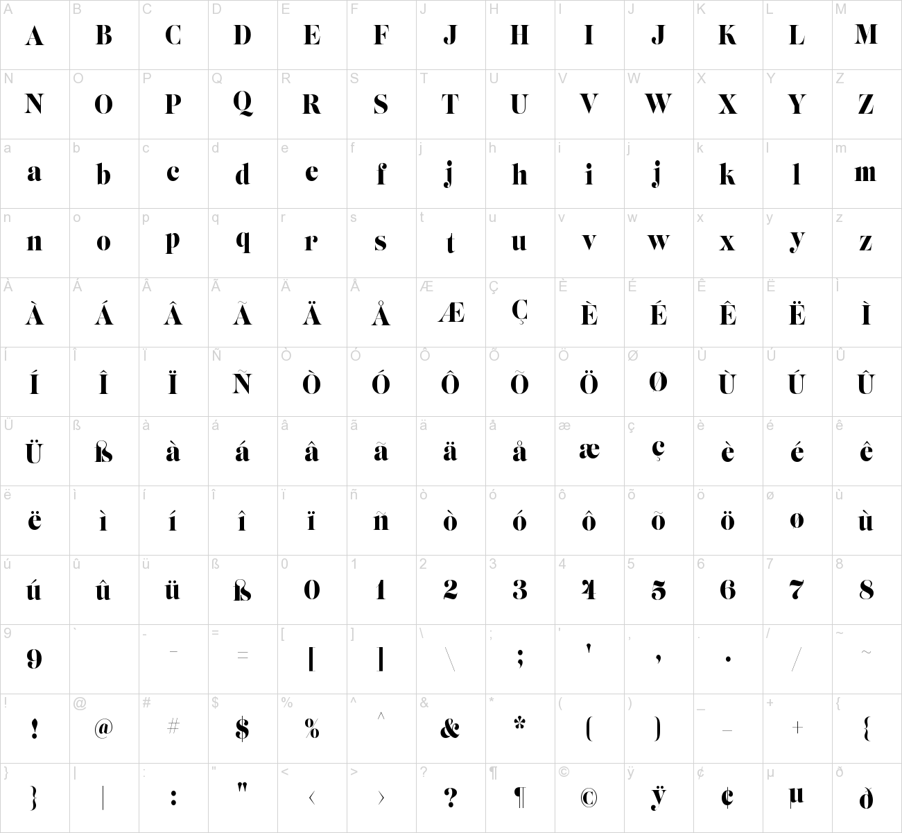
Lust Slim Font Family
If Lust Slim seems both new and familiar, that’s because it is. The series unapologetically channels Herb Lubalin, but produced with a deliberate, contemporary twist. There is an intentional slyness infused in the letterforms—the extreme thick and thin lines flow effortlessly without becoming gratuitous. It’s always just enough, not too much. What makes the type series so appealing? The curves. When asked to describe the letterforms, most people unwittingly allude to the human form, using adjectives usually reserved for describing physical traits… creating all-too-familiar comparisons. Summerour has grown to accept this as unavoidable and reasonable given his acknowledgement of its influences and has provided nuances within the letterforms to accentuate that.


Font info
| Designer Name: | Positype |
| Date: | August 3, 2017 |
| Downloads: | 182105 |
| Classification: | Serif Fonts, Style / Aesthetic Fonts |
| License: | Free for Commercial Use |
| Commercial License: | http://www.myfonts.com/fonts/positype/lust-slim/ |


Very cool