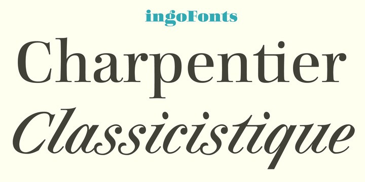
Charpentier Classicistique Serif Font, An unconventional classicistic Roman typeface
This Roman typeface has a livelier effect than is typical of the epoch of classicistic style.
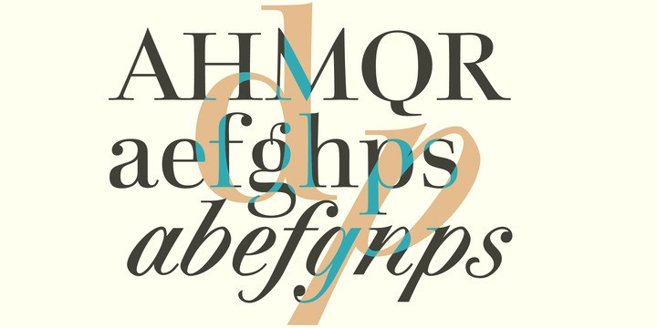
In the lower case letters, an echo of the smoother forms of historically early scripts is identifiable. Typical of a classicistic Roman typeface are the emphasized and clear contrast in the weight of the strokes, the fine serifs and the accentuation of the vertical bold stem. Charpentier Classicistique is pleasantly legible. Its effect is much less harsh than other classicistic fonts. The pointed forms of M and N are uncommon.
At 30°, the italic version of Charpentier Classicistique is unusually strongly slanted. The italic lower case letters refer, in part, to English handwriting, which also falls under classicism. Especially the curves show forms influenced by writing.
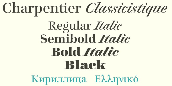
Charpentier Classicistique is available in four font weights:
regular, semibold, bold and black.
Thanks to OpenType and Unicode, Charpentier Classicistique Standard and Charpentier Classicistique Pro support all European languages including Turkish, Greek and Russian. Both versions include lots of ligatures, also discretional ones, as well as figures for normal setting and tabular figures with constant width and cap-height figures.
The font downloadable here is a reduced version (without punctuation, ligatures, numbers etc.). A commercial version of this font (with all features) is available at www.ingofonts.com.
Font info
| Designer Name: | ingoFonts |
| Date: | September 20, 2022 |
| Downloads: | 13030 |
| Classification: | Serif Fonts, Style / Aesthetic Fonts |
| License: | Free for Personal Use |


















Leave your comment