
Equitan Sans Font Family
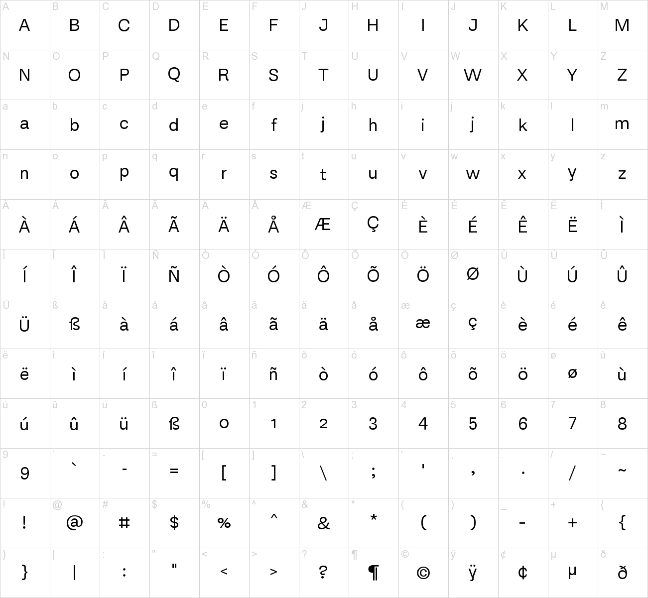
Part of the Equitan super family, Equitan Sans and Equitan Slab are ready for branding projects and packaging design. They serve up industrial-era letterforms, refreshed for a new century. Each of the seven weights has an upright and a italic variant, with 418 glyphs per font. The default numeral style in all 14 fonts are proportional oldstyle figures. Thanks to OpenType features, tabular versions are also available, as well as lining figures. Equitan Sans, with its closed apertures and arched shapes, resembles nineteenth century grotesques without becoming sterile, like so many mid-twentieth century neogrotesks. Wherever possible, counterforms are rounded, such as in b, d, p, q, 6, or 9 – even the bottom counter of the two-storey ‘g’ is round. The most recognisable character in Equitan Sans is the lowercase ‘y’, which has a straight tail instead of a diagonal one.


Font info
| Designer Name: | Indian Type Foundry |
| Date: | September 12, 2017 |
| Downloads: | 43902 |
| Classification: | Basic Fonts, Sans Serif Fonts |
| License: | Free for Commercial Use |
| Commercial License: | http://www.myfonts.com/fonts/indian-type-foundry/equitan-sans/ |


Leave your comment