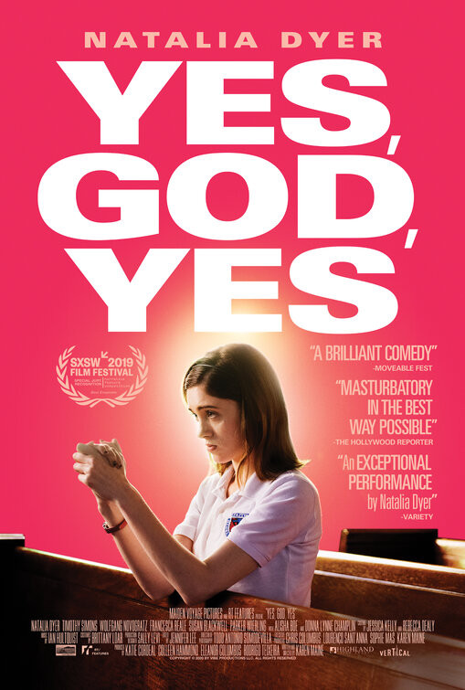
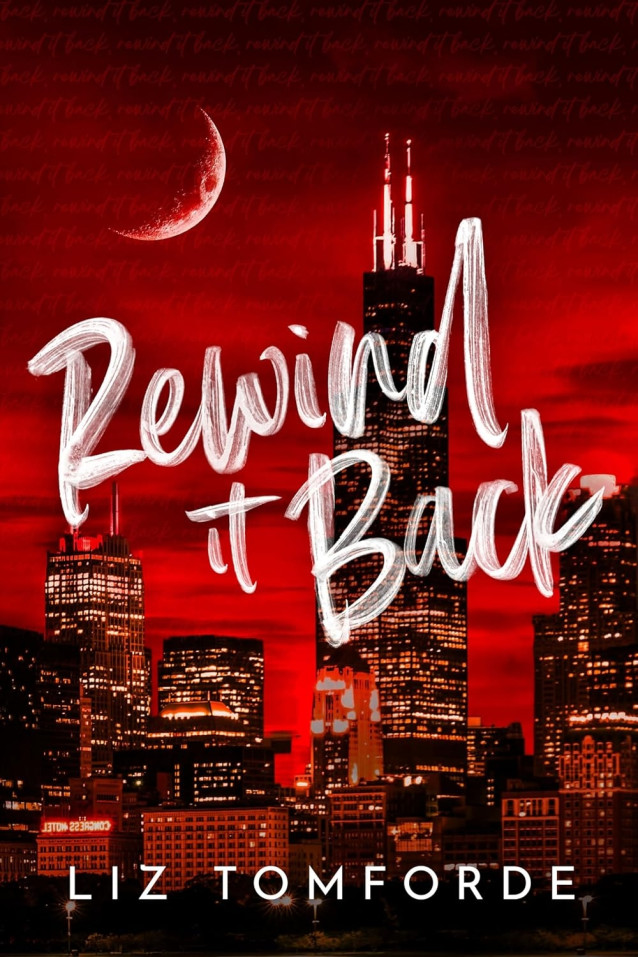
After an innocent AOL chat turns racy, a Catholic teenager in the early 00s discovers masturbating and struggles to suppress her new urges in the face of eternal damnation.
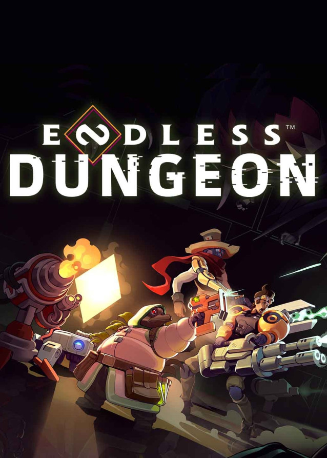
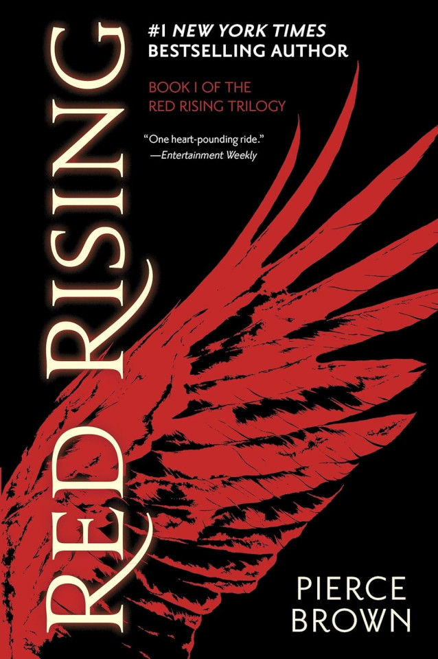
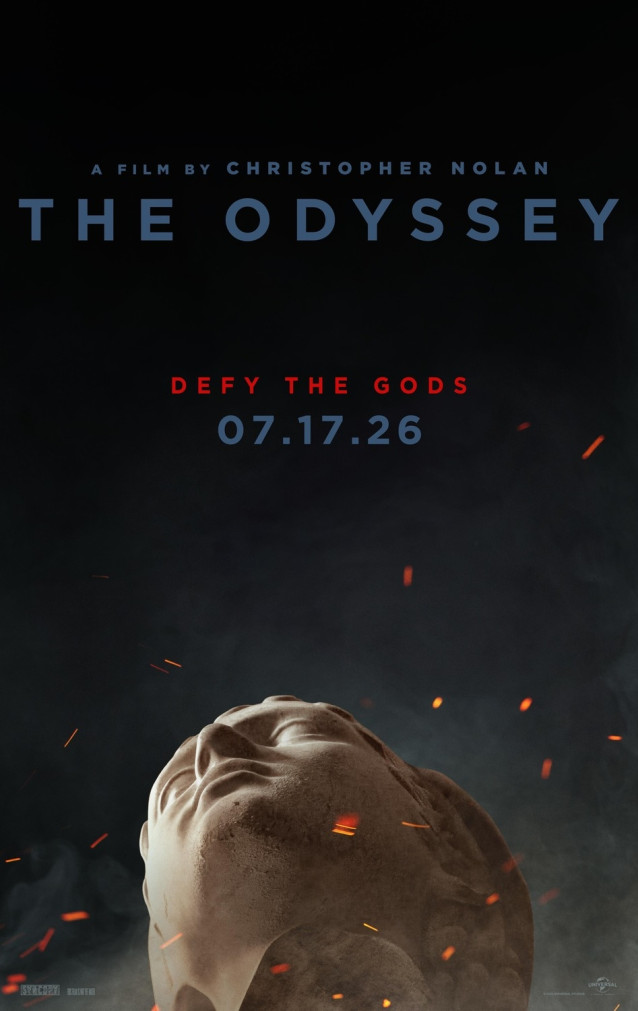
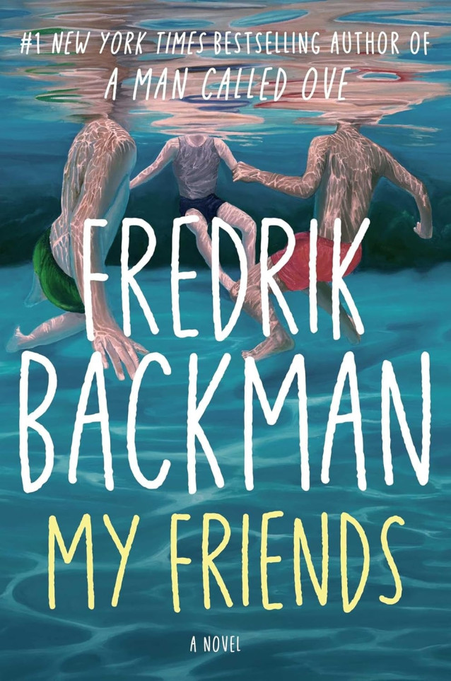
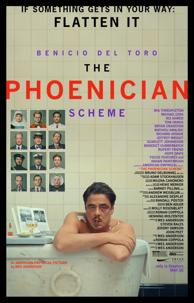
What Font Was Used in Poster?
The text on the poster we identify is created by Univers LT Pro Font .
Univers was designed by Adrian Frutiger on Swiss principles for Charles Peignot at Deberny & Peignot.
Frutiger imposed strict discipline across all elements of the series, from light to dark, extra condensed to extended, a concordance of design that was possible in the foundry type and photocomposition fonts. Any version may be mixed within a word with any other. It may be argued that the design of the most popular central series is limited by strict conformity to little used extremes. If Helvetica gives us the strongest central designs at some sacrifice in uniformity across the series, Univers gives us a uniform series by disciplining the central designs.
















Leave your comment