
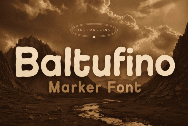


Baltufino feels like it was drawn — fast, bold, and a little bit fearless, exactly like someone grabbing a thick marker and writing straight from the wrist instead of carefully tracing with a pencil first. It’s a handwritten marker font at heart, but underneath the ink-heavy charm sits the quiet structure of a hand-lettered sans serif, which is what keeps it looking good in a real design instead of just a novelty.
Every letter in Baltufino carries visible weight. The strokes are thick and rounded, never thin or delicate, so the whole alphabet reads as bold from a distance — the kind of typeface that can carry a headline on its own without needing bold formatting layered on top. The terminals are soft and blunt rather than sharp, echoing the way a marker tip rounds off every stroke instead of coming to a crisp point. Curves swell generously — look at the “b,” “g,” or “o” — mimicking the way ink pools slightly where a hand slows down to turn a corner.
Baltufino Font: Bold Handwritten Marker Style Meets Hand-Lettered Sans Serif
This free version is for PERSONAL and trial use only — perfect for testing in your design drafts or personal projects.
Please note:
🚫 Commercial use is not allowed (including client work, business branding, product packaging, or social-media sales).
💡 If you wish to use it commercially, please purchase the full license on our website.
If you enjoy the font and want to support the creator, small donations are always appreciated 💖
👉 https://paypal.me/aldohsb
Thank you for respecting the license and helping independent designers keep creating beautiful fonts for everyone.
https://letterhanna.com/















Leave your comment