
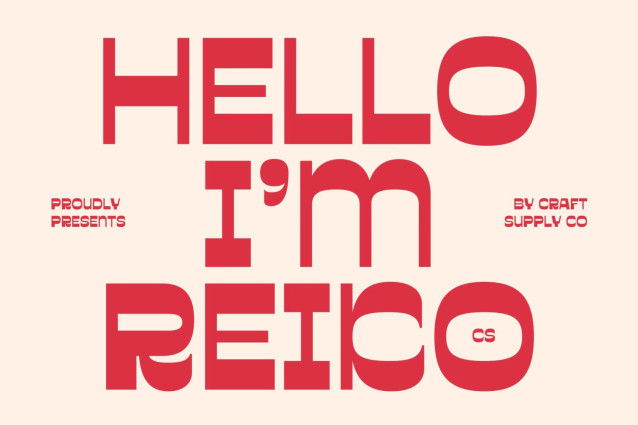
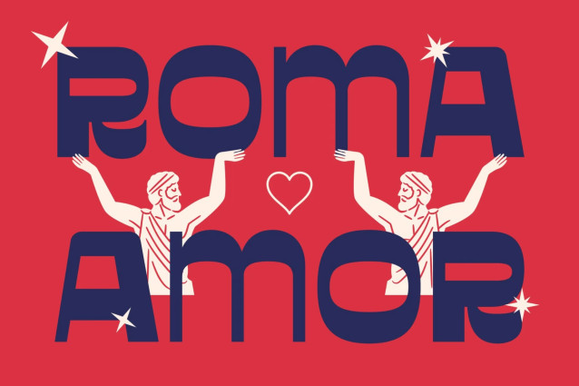
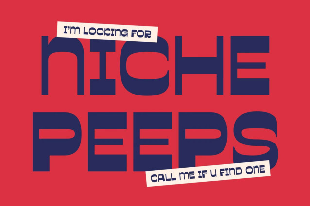
CS Reiko – Reverse Contrast Display Font: Where Modular Geometry Meets Retro Boldness
Bold Letterforms with Geometric Retro Style
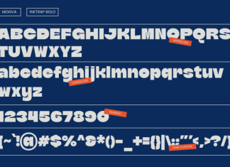
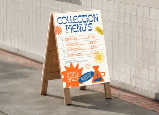
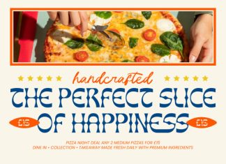
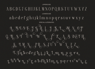
This is a reverse contrast display font that combines bold, high-impact letterforms with clean geometric shapes and a distinctive modular aesthetic. Its unconventional stroke contrast, where horizontal strokes are thicker than vertical ones, creates a striking visual identity that immediately captures attention. Inspired by classic design movements yet refined for contemporary use, it delivers typography that feels both nostalgic and fresh.
Modular Construction with Strong Visual Rhythm
This font embraces a modular approach that enhances consistency and visual balance. The bold proportions and clean construction create a powerful rhythm across headlines, making every composition appear confident, stylish, and highly memorable. Its retro-inspired design adds personality without sacrificing clarity or versatility.
🔥 NOTE 🔥
This DEMO font does not include all of its unicode glyphs, and for PERSONAL USE only.
Get the FULL VERSION and COMMERCIAL LICENSE here:
https://craftsupply.co/product/cs-reiko-reverse-contrast-font/
Get 97% OFF Bundle 395 fonts + illustrations + Logos:
https://craftsupply.co/bundle/
Every donation makes a meaningful impact:
Thanks,









Leave your comment