
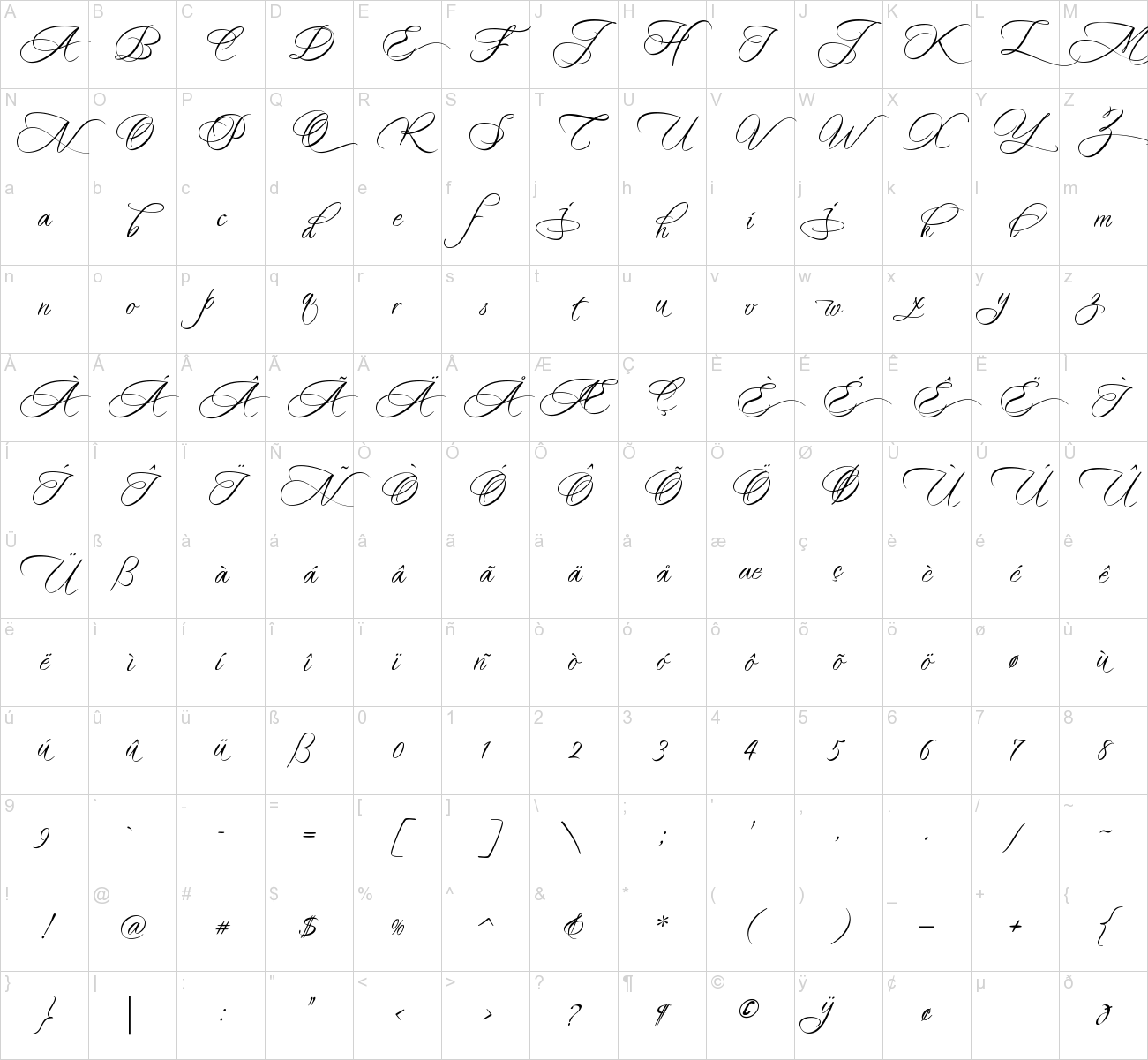
Madrigalle Font Family
Madrigalle was seven months in the making and may be described as a contemporary copperplate.
When designers look for a font that is both elaborate and strong, they generally have to go back to styles of a previous period, possibly produced recently but not contemporary in their look and feel. In Madrigalle, I believe that I’ve produced a font that is contemporary but has the boldness and delicacy that mark the fonts of previous generations.


Leave your comment